As an Android mobile app development company, we have always been driven by the basic UI development principle of using as few UI elements as possible. But because there are so many different interface elements and their combinations, often it's hard to tell which realization will show the best performance.
In the UI development, we can find a few UI element groups that are different by their purpose. In this post, we'll talk about content placing elements. People often call them containers, and in Android API they’re called layouts.
Containers are used so widely there is a vast amount of options for how they can be applied. Thus, you always have a problem of selecting the best fitting ones. Let’s study this problem on a test app.
Problem Statement
The most popular elements represented as Android OS containers are LinearLayout and RelativeLayout. Not only they are widely used, they are also mutually replaceable, meaning you can replace one container with the other without any major problems or consequences.
It is known that the primary difference between those containers is their approach to element positioning. In LinearLayout, positioning is based on the order of components inside, while in RelativeLayout you need to define the relative position of the element explicitly.
We believe the next criteria are important when it comes to selecting which container is the best for your task:
- Graphic part initialization time
- The required amount of virtual memory
- Easiness of use
You will probably agree that using LinearLayout is easier in most cases because of the element positioning simplicity (as compared to RelativeLayout). But despite this, in our practice, it often appears that for the same UI you'll need to use more LinearLayout elements than in the cases with RelativeLayout. And this is often the key argument in selecting the UI implementation approach.
But does this simplicity worth the potential performance loss due to the bigger number of interface elements? Let’s research that.
For our experiment, we will take the same interface and compare its different realizations. The first interface will be done using RelativeLayout containers, and the second one will take advantage of LinearLayout. For these purposes, a test application had been created.
In this app, our app builders for hire created 5 interfaces that are different only by the number of views in the container. The first type contains empty LinearLayout and RelativeLayout containers, and the other four types contain certain numbers of child elements. The elements are placed in rows of 20, and each type has from 5 to 20 of these rows.
The key difference of the interfaces using LinearLayout is that every row is placed in a separate container. So the number of containers used for every realization with LinearLayout is bigger than in the cases with RelativeLayout. The more rows we have in our user interface, the more extra LinearLayout containers we're using.
The fragment class where we place our UI realizations is the same for all types. Below we'll demonstrate how the selected criteria values are defined.
The app contains the table with test results and the test launch button. The test scenario is an alternate showing of LinearLayout and RelativeLayout realizations, 10 times each, and showing the measured values of the above-mentioned criteria.
Research results
To be able to analyze the results, guys from our Android app development company performed testing on three devices with different Android API versions and tech specs. Each interface was shown 50 times on every device. In this way we found average values for every criteria for every interface. Since the amounts of allocated memory were only very slightly different, the results on this criteria were evaluated as equal.
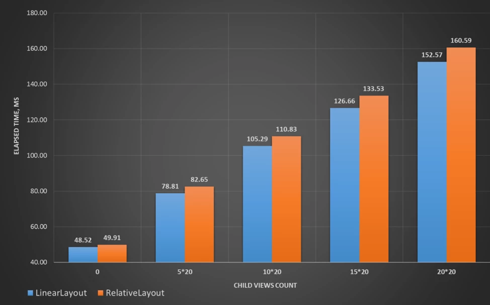
Here we can see the comparison of the UI initialization time for each container type and every interface.

As you see, the interface initialization time in all cases is lower for LinearLayout despite the fact that the overall number of containers is bigger compared to RelativeLayout. It becomes obvious that using LinearLayout for containers is not only simpler but also shows better performance.
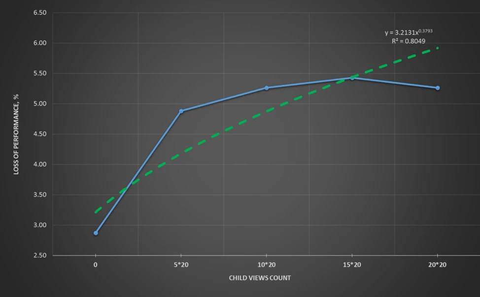
Below we can see the average deviation of the initialization time for each interface. You can also notice the green trend line and its characteristics.

The dependence we've got with the trend line is fair only within the data we collected, so we only analyzed the function behavior.
On the graph above we can see that the more elements the interface has, the less is the difference in the performance of the compared realizations. In other words, the more interface elements you have, the more advantageous it is to use LinearLayout.
To figure out why we've got such an outcome, we need to understand how the container performance depends on the number of elements it contains. At our Android development company, we believe the primary reason for these results is the implementation of component positioning inside the container.
If we take a look at the code behind LinearLayout, especially its way of rebooting the onMeasure method, then we'll notice that for our circumstances the internal element enumeration happens only once (the maximum number of enumeration times in this method is three).
And now let's look at the code behind RelativeLayout. Within the same method, we can notice that the internal element enumeration happens three times (7 is the maximum number). This happens mostly because in case with RelativeLayout positioning it needs to perform a series of operations for all internal elements both horizontally and vertically, while with LinearLayout it is done only on one axis.
If we ignore the performance difference caused by the difference of logic implemented in these containers and only follow the idea that the bigger number of enumeration times will show worse performance outcomes, then it explains the results we've got with our app.
Bottom line
Despite the fact that the LinearLayout interface realization had more elements, they turned out to show better performance comparing with the similar realizations based on RelativeLayout. Apart from that, we can also outline the next outcomes:
- the difference in the performance of the containers compared is explained by the UI initialization time
- because of the slight difference in the criteria values, for the simple interfaces, you can neglect the performance difference and be driven only by the easiness of use
- Based on the trend of the performance dropping with the raise of the number of elements in RelativeLayout containers, the more complicated interfaces should use LinearLayout realizations
These results should be used as a way of performance increase during the code design or refactoring stages.


