


You probably know that Marvel is a great tool for quick prototyping and hypothesis testing, especially if you provide web design and development services. However, when it comes to passing the design to front-end developers, there's a lot of peculiarities and pitfalls you should know before opening the Marvel document.
Handoff Mode Basics
Let's start with a few basics of the Handoff mode available for designers and developers.
When you open the Handoff mode, you can immediately notice two panels on the sides: the Layers panel on the left and the Inspector panel on the right.
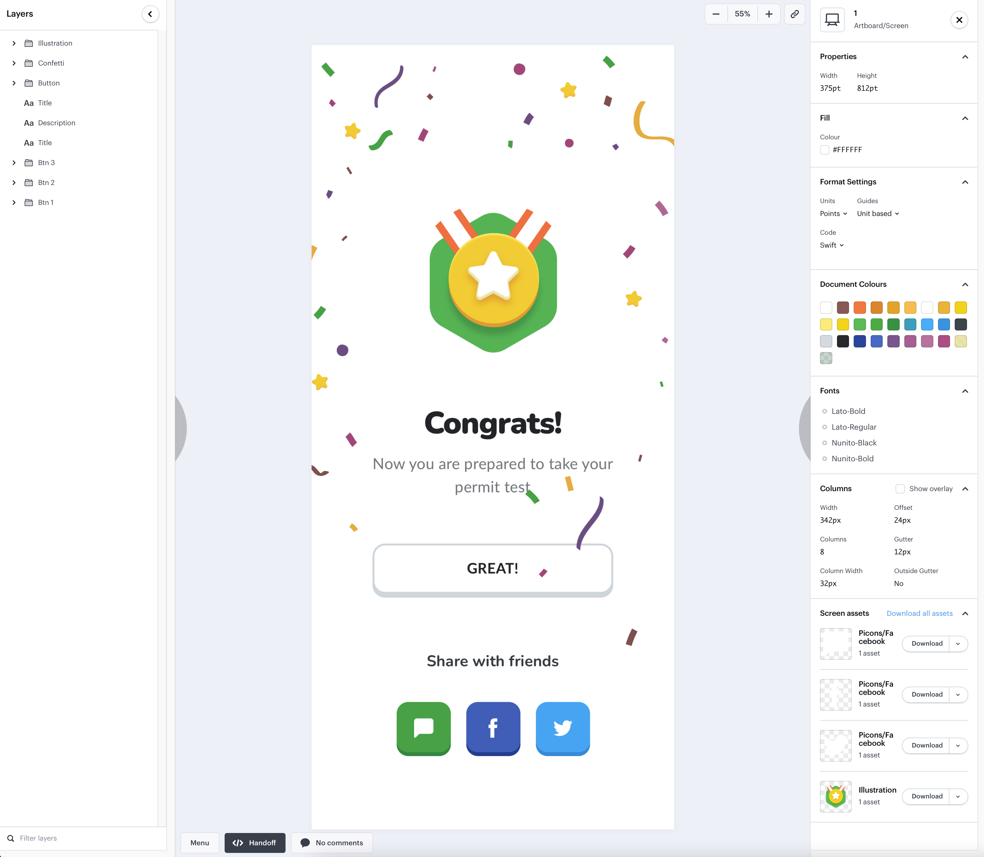
Each element on the screen is introduced as a layer with its own properties defined in Inspector. Any information from Inspector can be copied with a click of a button.
It often happens that UI design agency experts use an illustration or a picture that covers a few of the elements, making them unclickable in the view. The only way to reach them (and see their parameters) then is through the Layers panel.
Due to this, we have an internal rule to make the layer names as informative and clear as possible for quicker access.
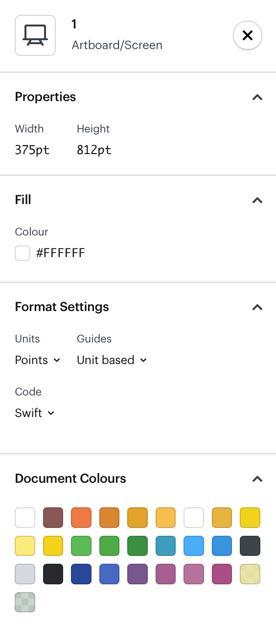
On the right, we have the Inspector panel which shows the general properties of the project if no object/layer is selected. Most of the parameters are obvious: the size of the view, the background color, and format settings. In the Document Colors area, Marvel shows the colors already used in the view, yet we don't find it handy and usually hide it.
The list of fonts used in the view would also be much more useful if it allowed downloading the fonts lacking in your system.
The columns area allows showing the view grid and reveals the number of columns and their width. Notice that designers might not rely on this grid and thus it should not necessarily be used as a reference at all times.
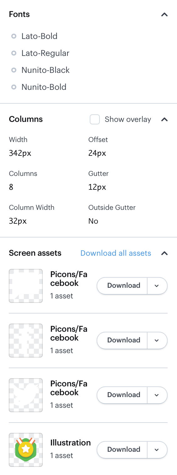
Screen assets are the list of graphic resources you can download for your needs. The counter of assets reveals the formats and extensions your assets are available in, like .PNG, .JPG, etc. In our design department, we prepare as many outputs as we can for the sake of convenience.
Once you select any container/layer on the view, the Inspector panel will reveal the properties of the container. For instance, in the case of the button, you'll see its sizes, style, color, and shadow.
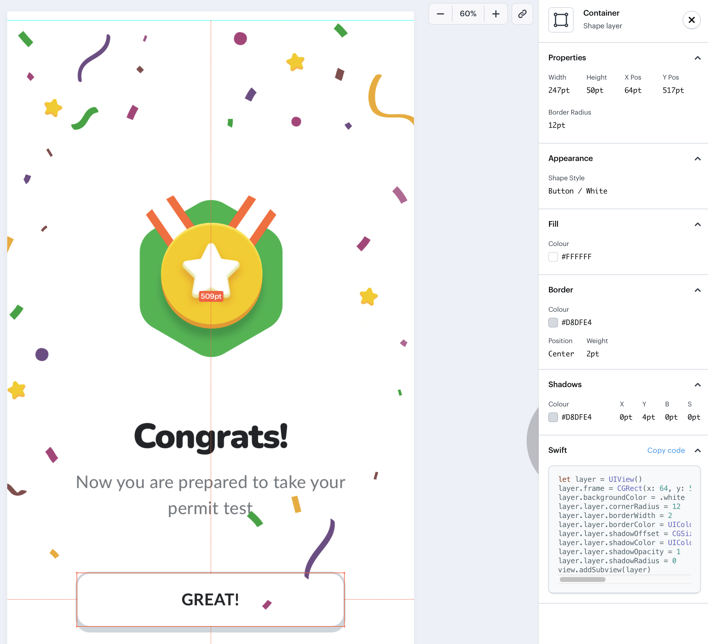
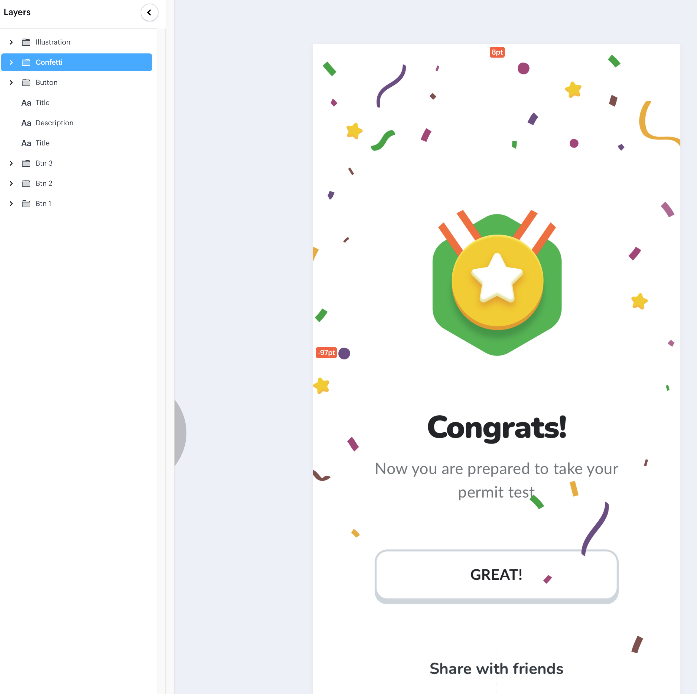
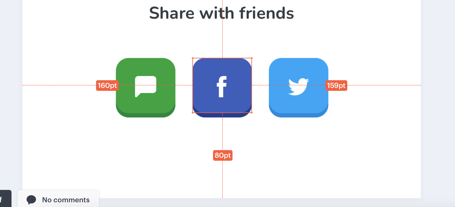
Let's say we selected a shape. By clicking it, you can notice its relation to the surrounding elements, as well as the distance to the edges of the view. The Inspector panel will reveal its basic properties – in our case, it is its sizes and fill color.
In Inspector you can also find and copy the CSS code of the element if it proves to be useful for you.
Now let’s proceed to more specific aspects of Marvel important for web and app development engineers.
The Store
Check for more


Marvel: Working With Shapes
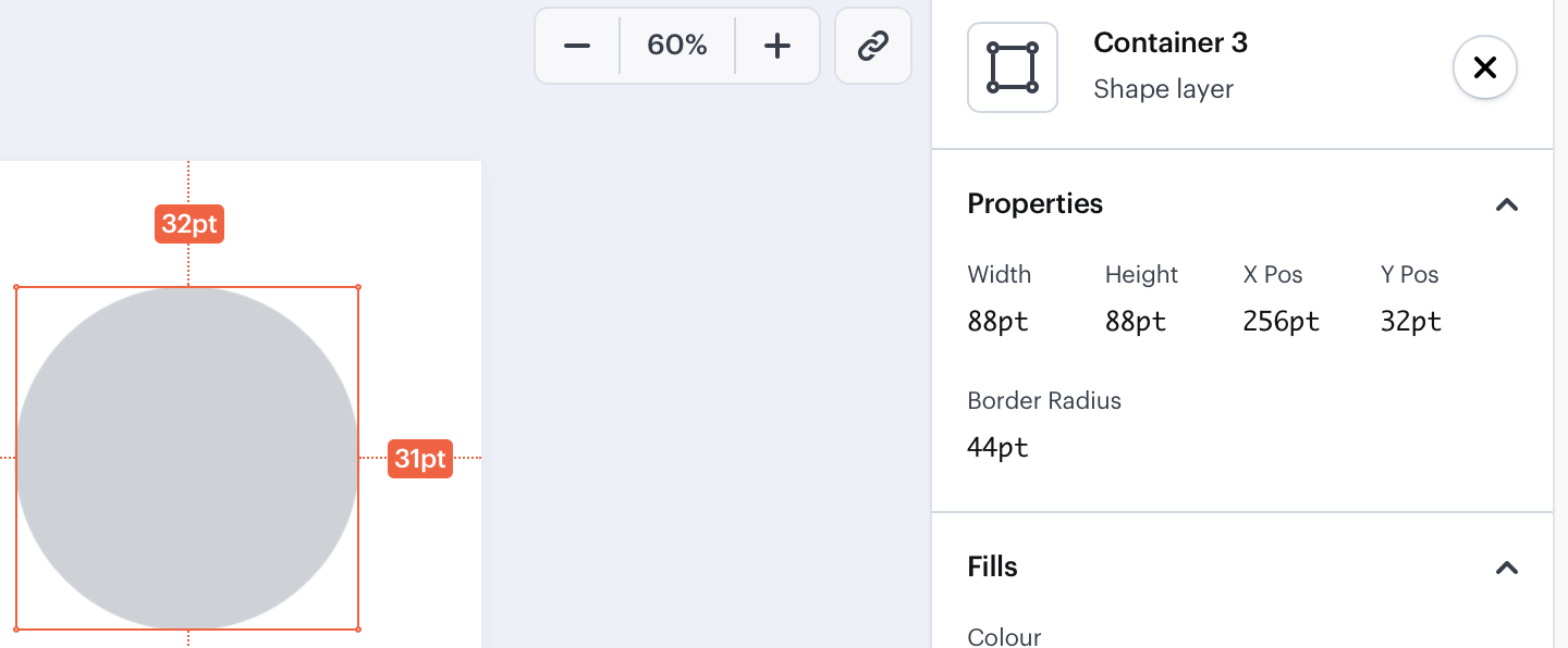
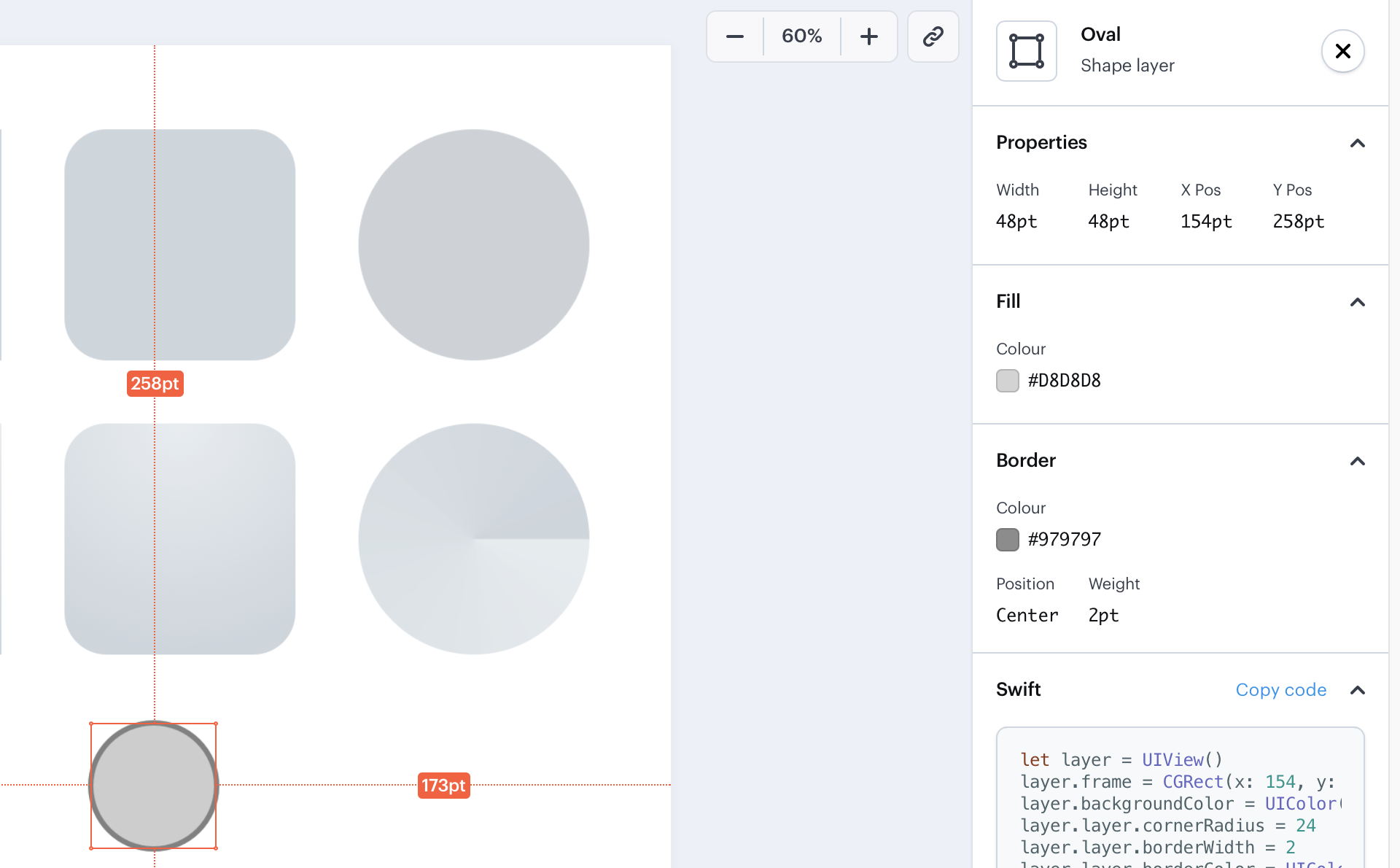
Here's an example of three shapes with different properties.

The middle one has rounded corners, and you'll figure this through the Border Radius property in Inspector.
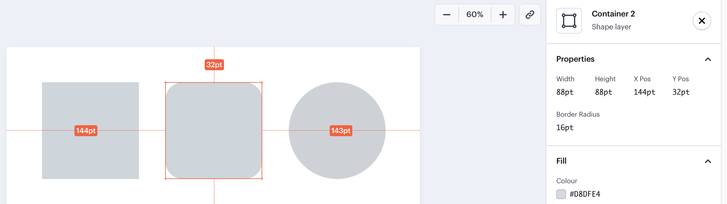
However, there might be situations when a designer was in a hurry and instead of making a round shape made a rectangle with the maxed border radius to make it look like a circle. A true circle won't have a border radius property.
Shapes usually have one color. But in design, we can add another color. In this case, the inspector will show two colors. The second color can also be transparent to some degree. You'll see the corresponding property in Inspector as well.
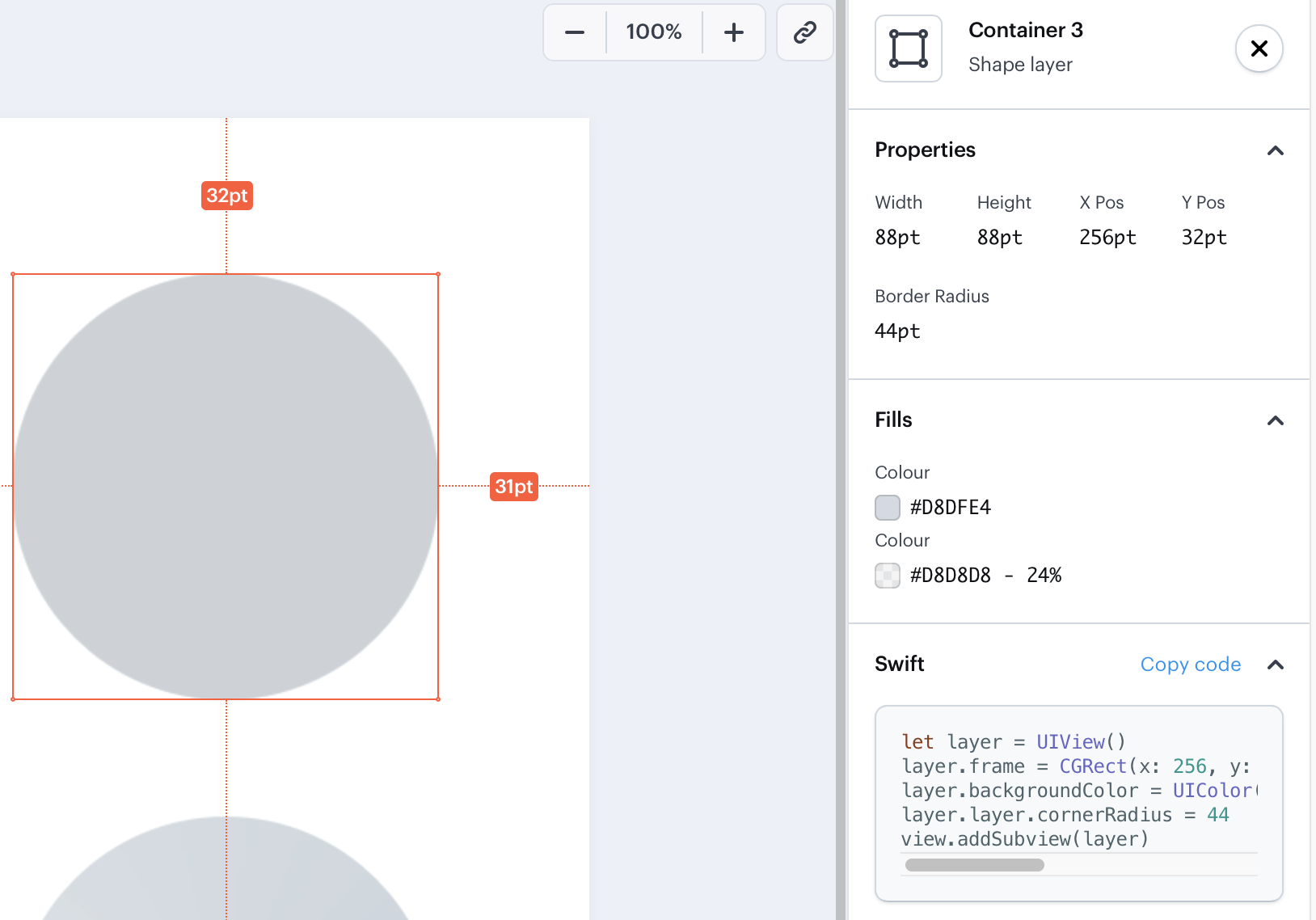
Shapes can also have borders. The inspector will report on the color, position, and weight of this border.
Marvel: Defining the Opacity
In Marvel, you can set the opacity for different elements. Inspector will show there's not only one fill color but also opacity applied.
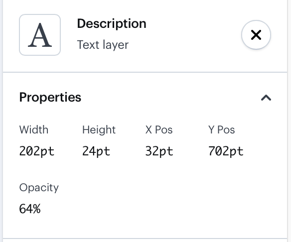
However, sometimes a UX/graphic design specialist might erroneously apply opacity to an element instead of a color. In this case, the opacity will be shown in the block properties, where you can easily miss it.
Marvel: Types of Gradients
Gradients in Marvel can be linear, radial, or angular. Inspector reveals the type of the gradient used and shows the colors used for it.

The angular gradient is used quite rarely but still will cause problems in code realisation since CSS does not have easy tools for that. In each particular case you'll need to find workarounds.
In general, often Marvel can't contain additional information that is important for developers. In this case we leave comments in Marvel.
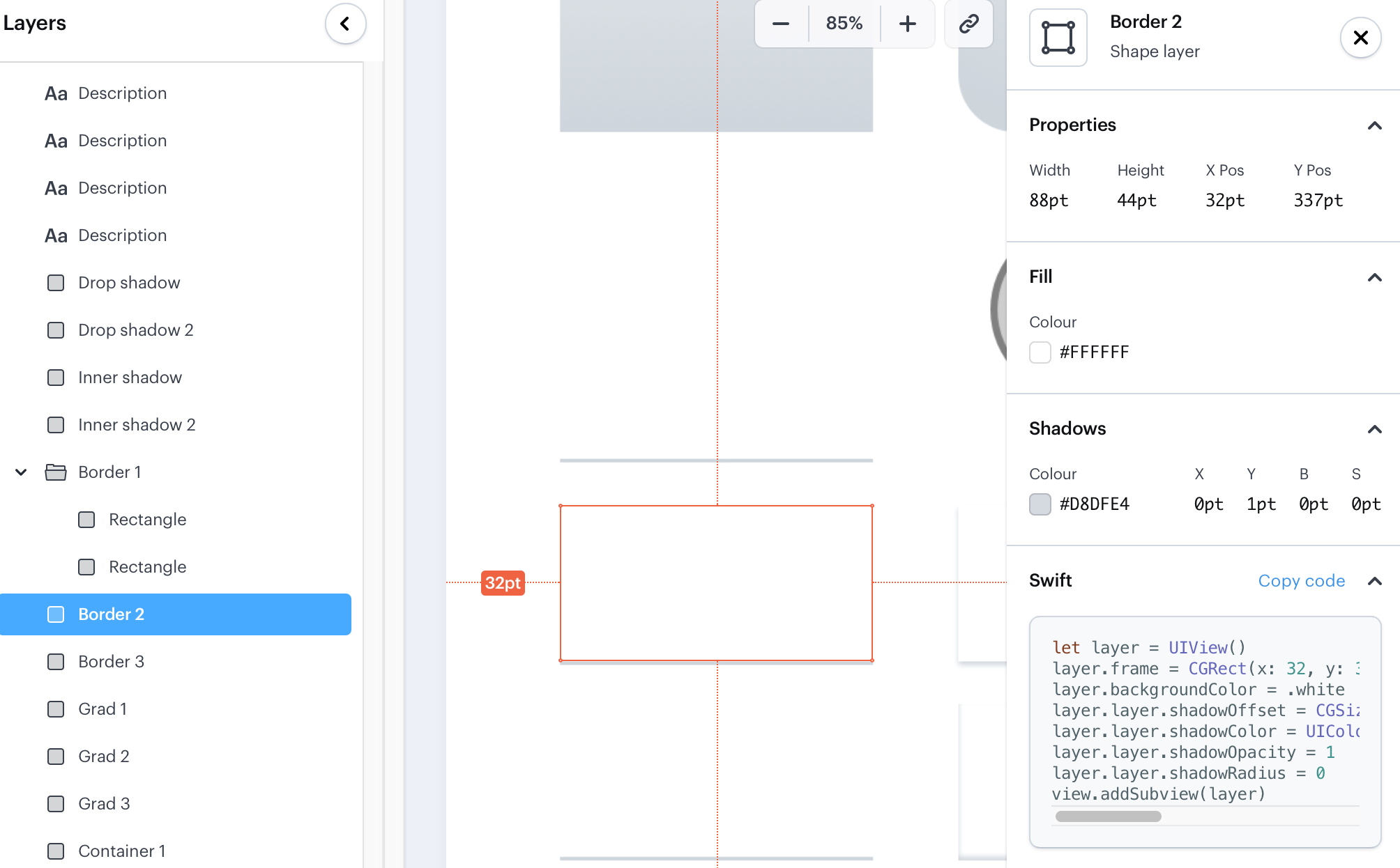
Marvel: Ways to Represent Borders and Shadows
Borders can be designed in three different ways.
1) One layer is a container with a fill color and the border is a separate layer with its own size and fill color.
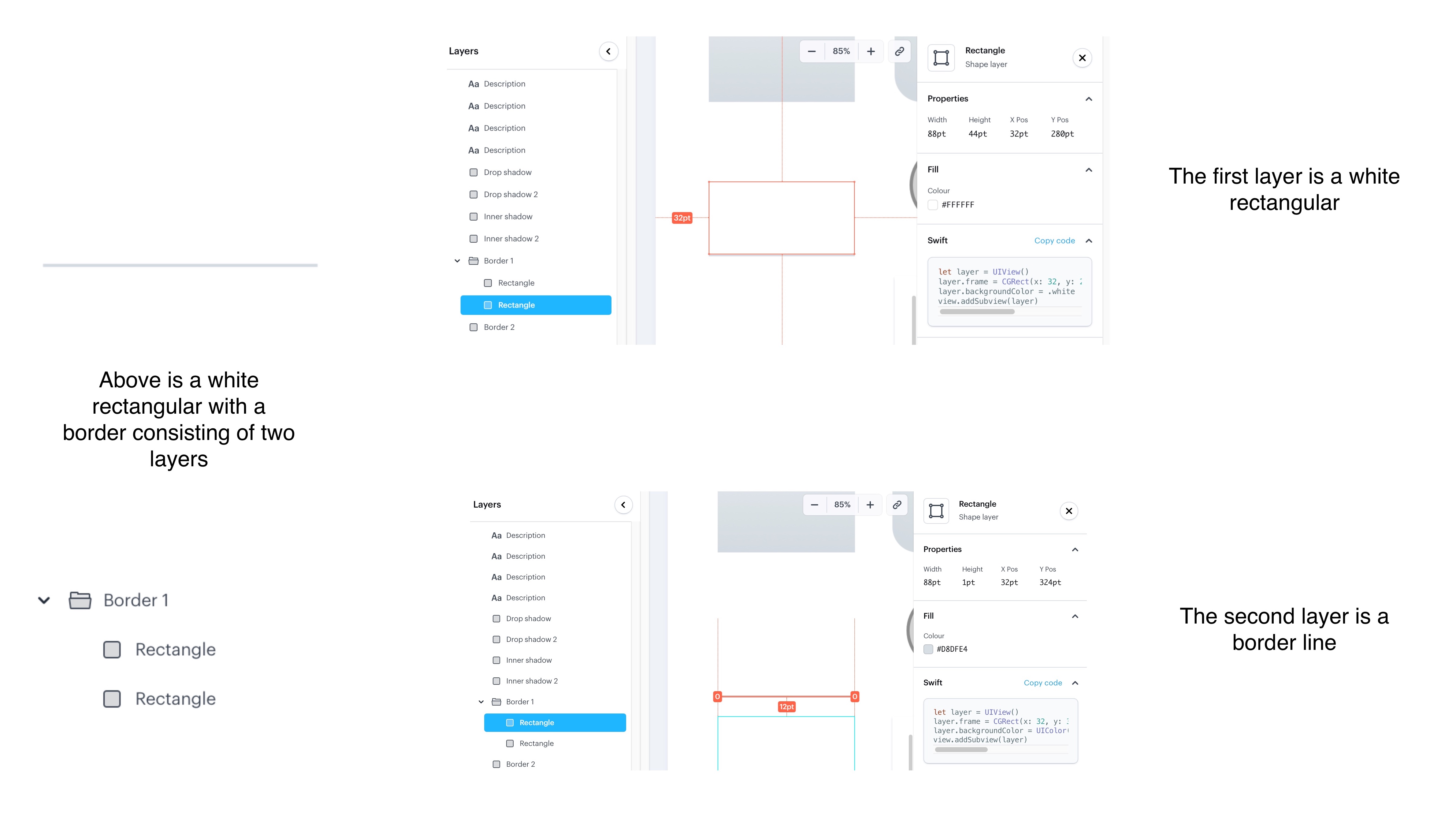
2) One block and a shadow 1 pixel\point high of a specific color. This is our preferable way as it is easier to operate with one block (to resize it, move it, copy it, and the whole info is one size). But you can decide how you're going to do that border.
3) The same thing can be done through the inner shadow, a bit different tool.
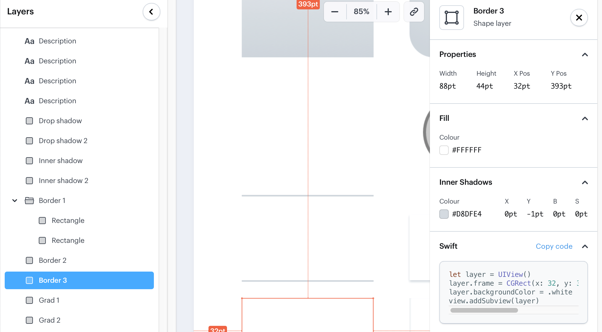
Each designer might have their own way of doing it. However, in code, you can do it in your preferable way.
Notice that sometimes US/graphic design experts can apply a few shadows to a single block.
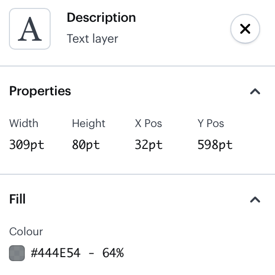
Marvel: Specifics of Text Layers
A text layer will have the next properties: properties, opacity(if applied), type color.
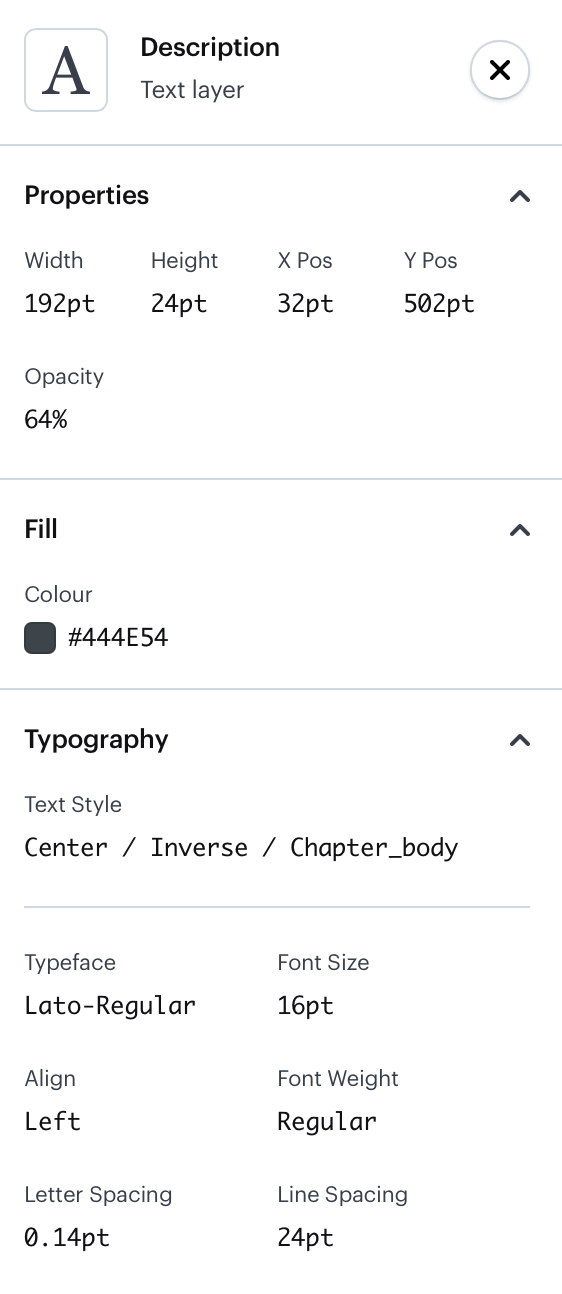
The type properties in Inspector are pretty self-explanatory but pay extra attention to letter spacing and line spacing. It is easy to forget them, yet if they're custom, the QA engineer will eventually come to you and report that different devices show the text in different ways. That's because letter spacing was not applied.
Line spacing is visually represented with the red line surrounding the text element.
Here are three text examples. Every text block has a container. In design, we cannot define the paddings. To pass block dimensions, we can use text containers. If it goes from one text margin to the other, it means we did not intend to have any parameters affecting the block responsiveness.
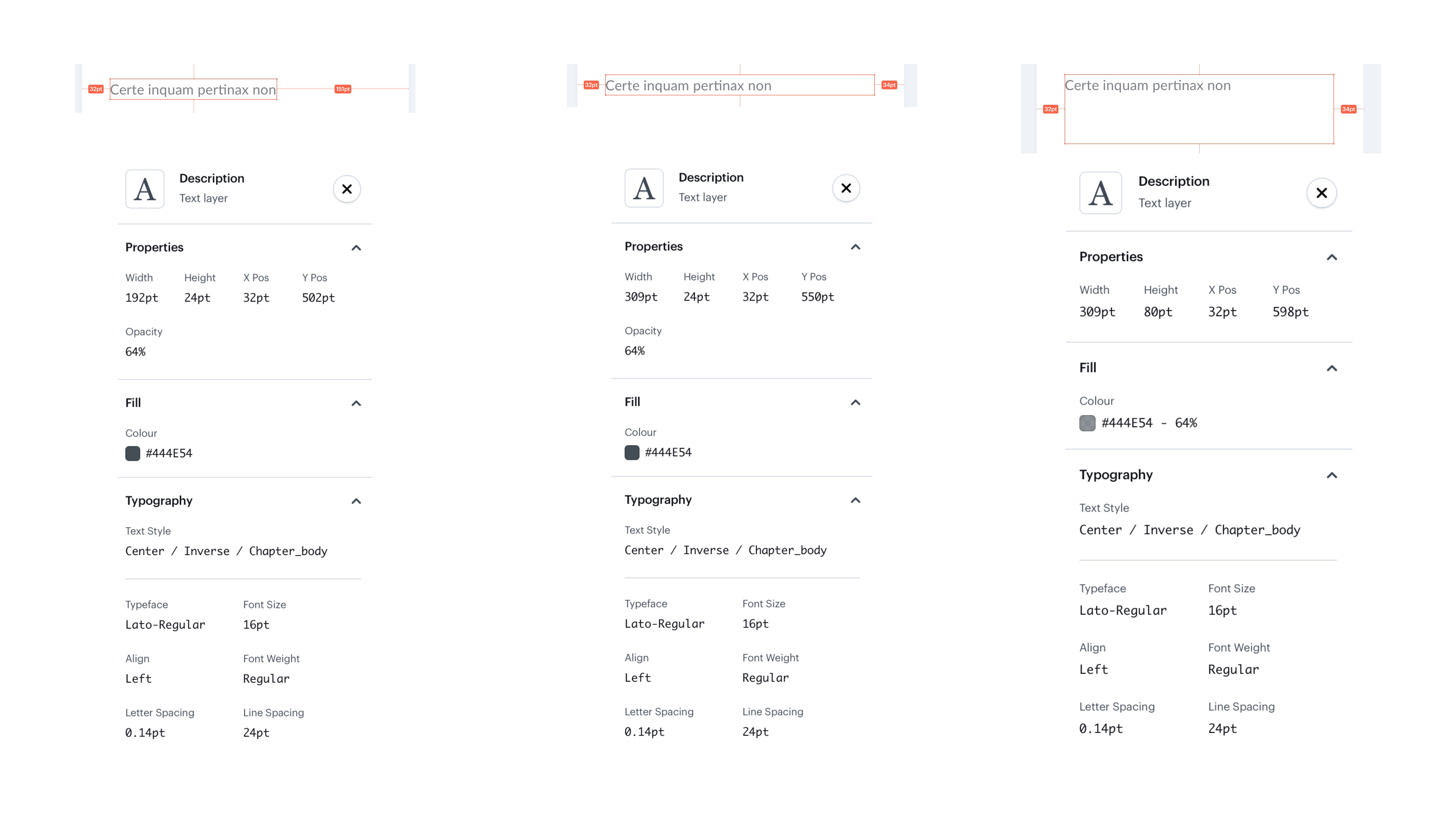
However, we can imply some limits the text should be placed within. For instance, we can set side margins or paddings. We can also set the maximum size of the text block.
Let’s say, we need to make a responsive input, when the input box increases along with the text. In the third case, the text should be within the set limits. In case the text doesn't fit the block, we need to decide on its behavior, whether the scroll gets enabled, or three dots are shown.
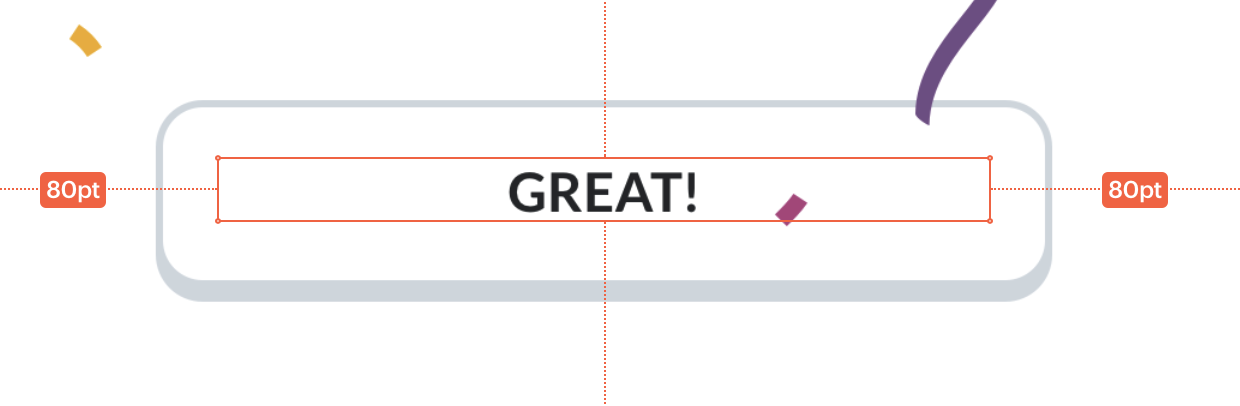
Another example. An app has a place for a text that should be struck through, underlined, or go in capitals at all times. In Marvel, the only way to specify such requirements is to leave a comment.
Notice how paddings are set via the element. This block is bigger than the text demands it. That's because we set minimal width for it. For instance, the minimal width of the button is 100 points. So even if the button text is only one letter long, it will still be 100 points wide. But again, there is no way to convey this approach through Marvel directly. It should be described in the style guide and/or Marvel comments.
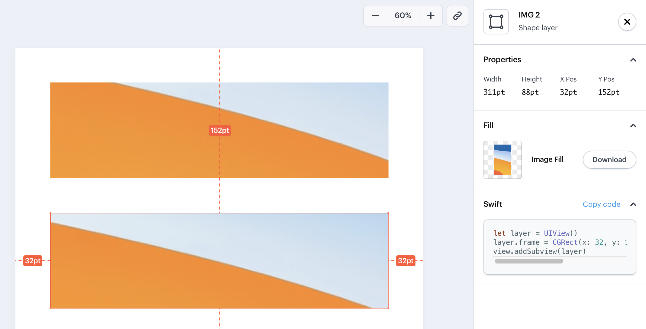
Marvel: Working With Images
We can pass images to Marvel in different ways.
Sometimes you can get the situation when you select the image but you see the turquoise contour that shows a completely different size.
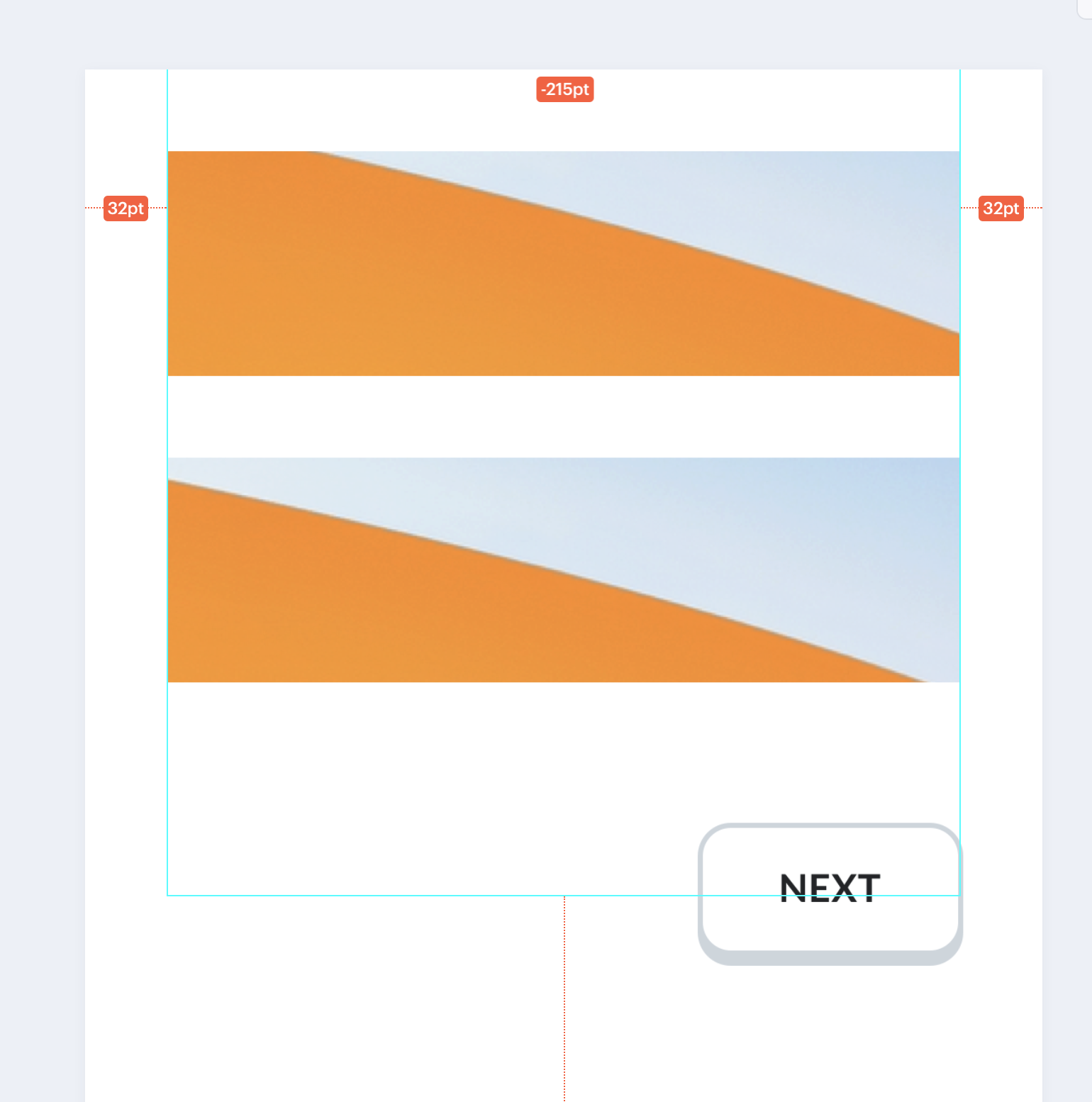
That means there are two independent layers: a container that works as a mask and an image that is put into this mask. In previous versions, Marvel would show it but now if you click the image you'll select the bitmap contour of the whole group only, hence its big size. To find out the actual specs of the block you'll need to select the corresponding container layer on the left.
Bottom line
There's no doubt Marvel speeds up startup app development processes. However, as with any tool, it has its own limitations that are best to be known before you start working with it.
And while some disadvantages can be easily addressed with comments inside Marvel, the design and development teams should eventually come to their own specific rules and way of communication when using it.
In our case, for instance, we often use styles (a feature available in most graphic editors) to apply sets of the same properties for different objects with one click. For the sake of convenience, we agreed to name and mention those styles in comments or layer names so that developers could leverage the same approach in code.
Still, we hope this little guide will help you make the most out of Marvel.